Project Overview
Team Roles: UI/UX Researcher, UI/UX Designer
Time Period: January - March 2024
Through: Project class in Human-Computer Interaction
For this project, we were tasked with working in groups to design an application pertaining to wellness. Considering this prompt, our group decided to focus on the topic of time spent in green spaces. During my preliminary research, I found that according to UC Davis Health, spending time in nature improves both physical and mental health, and the results of an APM Research Lab study reported that one of the most common reasons preventing Americans from being in nature was their work. So, my group decided to focus on working adults as our demographic, as they would derive the most benefit from spending more time in green spaces. I learned a lot over the span of this project, and this page will detail the process work of it!
Competitive Analysis
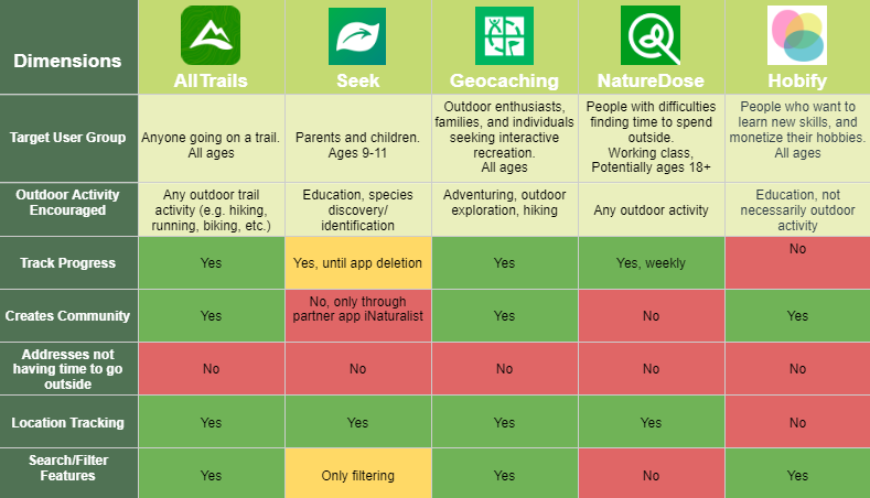
The first thing we did as a group was conduct a competitive analysis on the market of applications that encourage users to spend time outdoors. I personally completed the analysis of AllTrails, and helped develop the dimensions of analysis. We found that none of our analyzed applications were targeted at working professionals, nor did they assist users who were busy in finding time to spend outdoors. We also found that the majority of these applications had some form of location tracking feature. These findings helped inform our problem statement.
Problem Statement
After conducting our background research, we were ready to finalize our problem statement. Due to a lack of applications that encourage users to spend time in green spaces that are aimed at working professionals, we decided to focus on them as our target user group, which was a decision I personally advocated for. However, before we could start prototyping, we had to identify what our target user group's needs were.
"How might we design an application to encourage working professionals in the US to explore green spaces?"
"Primarily, [my barrier to spending time in green spaces is] time."
- Anonymous Interview Participant
"[My goal when visiting a green space is to] Just get away from home actually, if I can do the same stuff that I can do in my house but be outside then I think that would be really nice."
- Anonymous Interview Participant
User Research + Personas
We then each conducted interviews with working professionals at a variety of points of their careers that represented different user needs. All of our interview participants were working professionals working full time, with a majority working primarily between the hours of 9 am-5 pm. We found that while there is an overall desire to spend more time in green spaces, and distance usually is not an issue, the biggest obstacles to spending time in green spaces were time and motivation. Below are the main insights my team and I derived from our total of 10 interviews, 2 per group member.
People want to explore green spaces but work consumes most of their daylight hours and energy
If not work, then commitments after work, like children
People prefer to be outside during the day
People are willing to incorporate technology into their time spent in green spaces as long as the technology is not distracting
Social media has motivating features (likes, sharing memories) that can be streamlined into a more focused application, but is also is negative in its addictiveness
Gamified applications can be motivating and provide a sense of reward
Management at work can promote green spaces in their events but change starts with promoting it in their professional culture as an integral part of work and not just another event that gets lost in an email
Outdoor time feels like a large time commitment, whereas social media/phone scrolling is perceived as a lot easier to access
People need some sort of goal/incentive to encourage them to go outside
Interview Insights
From these insights, my group and I were able to create two personas: the middle-aged parent with familial commitments, and the recent university graduate stepping into the full-time workforce. Despite their differences, they share both the goals of wanting to spend time in green spaces, as well as work being a large obstacle to doing so. I personally worked on the preliminary drafts of these personas, as well as the final edits and color graphics.
Persona 1: Georgia
This persona was based on middle-aged interview participants, as our group found that this demographic tended to have transportation, however, they had more after-work commitments preventing them from accessing green spaces as often as they would like. This persona is able to use technology affectively, but is not as interested in integrating it into green spaces as the second persona.
Persona 2: Robert
This persona was based on our younger interview participants, as our group found that they struggled more with transportation, but they had less after-work commitments. This persona is also more accustomed to technology and is more willing to incorporate social-media like features and gamification.
Low/Mid-fi Prototyping
Based on our user research, a teammate and I identified that the best way for our application to address the concern of work taking up people's time in green spaces was to integrate spending time in green spaces into the workplace. Using our research data and personas, the whole group then started to brainstorm. We all individually created a few low-fidelity sketch prototypes of potential features, some of which are shown below. The rightmost sketch of a calendar feature was mine, and this concept ended up making its way into the final prototype.
NatureWork Features
Home Page
The user can browse nearby green spaces
The user's calendar is imported in to show when they can spend time outside
Events Page
Company groups post events that are being hosted in green spaces for employees to add to their calendar
Users can join groups to be shown their events
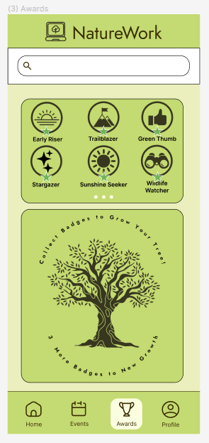
Awards Page
The user should earn various badges for time spent in green spaces
Badges earned grow their virtual tree to show a sense of progress
After sketching, we all worked together to condense all of our most common ideas down into a single prototype, with features such as gamification through awards, social media features such as a feed, and time management help through a calendar function. For our mid-fi prototype, we decided to condense some of the common ideas such as a calendar and location feature into a home screen. We incorporated the social aspect of the application into a community events page, which I worked on, and gamification into an achievements page. We also included other potential pages on the bottom menu bar, such as a tab for solo reflection, and a profile page.
Hi-Fi Prototyping
Our first high-fidelity prototype did not change many of the features of the mid-fidelity prototype, but we did decide on a color palette. The work assignments remained the same, so I kept working on the events page. We also scrapped the "reflect" page, as we did not have a clear idea of what it was supposed to entail, nor did it line up with a lot of our user needs looking back on our data. The final big change was that we added a new screen, the profile screen, which is standard practice for many mobile applications. This prototype also contained interactive elements, which were a calendar pop-up, a green space details pop-up, and bottom menu interactivity. This prototype was peer reviewed in class, and after a few adjustments, we arrived at our final product!
This is the final product of our quarter of work on this project! The main pieces of feedback incorporated into this prototype were that our peers found the colors of the previous iteration overwhelming, so we toned down the use of color, opting for less bright green. We also adjusted text sizing to better convey information hierarchy. This prototype's interaction flow was adjusted so that no pop-ups were present upon start up, reflecting how mobile applications work in practice. For this prototype, I adjusted all the screens to reflect the feedback we received, and a few of my teammates made design alterations as well. The most major changes to each screen outside of color and text sizing alterations are listed below. Click the button to test it out!
Final Product
Awards Screen
- Adjusted the dot scroll bar on the awards to be more visible
- Simplified the tree image
- Changed the text surrounding the tree from being curved to straight, as well as increasing its size for readability
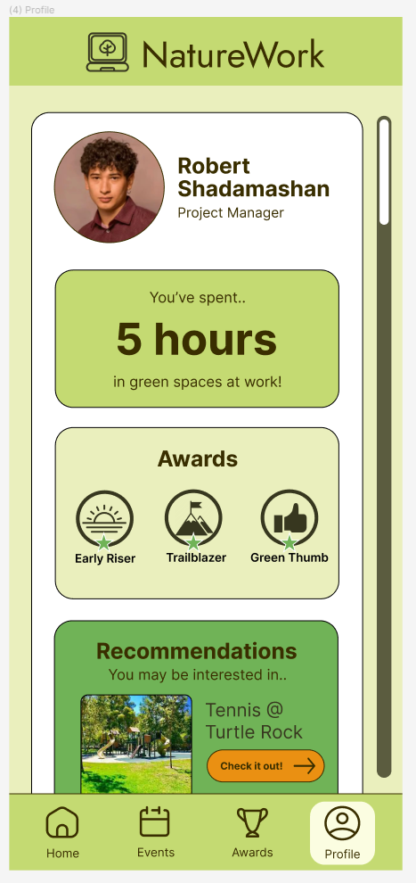
Profile Screen
- Removed redundant scroll bar
- Removed redundant location recommendation, and replaced it with a section containing the user's favorite green spaces
Home Screen
- Adjusted so the calendar pop-up was bigger, as well as its exit button
- Removed location description from location pop-up to simplify it and remove redundancy from the expanded pop-up
- The expanded location-pop up now takes up the entire screen, better reflecting mobile design practices
- Added a dot scroll bar to the expanded location pop-up to convey the images are browsable
Events Screen
- Adjusted text sizing for more clear readability
- Removed scroll bar, as it was redundant
Reflection
While working on this project I personally learned a lot, as it is one thing to study design principles, and it is another to get hands-on design practice. Our group overcame many design challenges, and the progress we have made over this quarter has been very exciting to see. We got to practice interviewing, deriving insights, creating personas, designing for a specific audience, Figma prototyping, and incorporating feedback into our design. We got to be creative with our solution, while still attempting to address a real-world problem that people face, and being receptive to feedback all the while. This project has really shown me how transformative software can be in people's lives, and that designing for the users first is best practice. While there are certainly things to be improved on our final prototype, our team is happy with the work we were able to produce in 10 weeks, and I look forward to working on other UI design projects.


